

How to Use the Psychology of Colour in Buying Art Prints
Pick the Perfect Prints to Enhance Your Home Decor

Have you ever wondered why certain colours affect your mood and emotions differently?
As art enthusiasts and art print buyers, understanding the impact of colour in our art prints and styling is really helpful. The right colour palette can transform a space, evoke certain emotions and set the tone for the entire room. If you want to change the mood of your interior, why not try an art print.
Have you ever walked into a room and loved the feel of it but don’t know why?
It could be the colours of its walls, art or furniture.
By incorporating the principles of colour psychology into your art print selections, you can create a more harmonious and balanced living space. Using art prints to change the mood of your space is the most affordable and easiest way to achieve it.
In this blog post, we'll dive into the emotions and moods associated with different colours and how to use them effectively in your art prints and styling, whether for a kitchen, hallway, entrance or any other space.
Understanding the Psychology of Colour
Colour psychology studies how different colours affect human behaviour, mood, and emotions.
As an artist or interior decorator, you can create a desired atmosphere and evoke a particular emotional response in people by choosing the right colour.
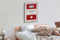
Colours have different meanings and associations in various cultures and contexts, but some universal associations exist. For example, red is often associated with passion, excitement, which you will see is perfect for a bedroom. While blue is associated with calmness, trustworthiness, and stability.
How to Choose Colours for Your Art Prints
When choosing colours for your art prints, consider the room or space where the print will be displayed and the mood or emotion you want to evoke.
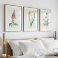
For example, in a bedroom, you may want to choose calming colours like blues, greens, or purples to create a peaceful and relaxing atmosphere or red prints, for a more romantic feel.
Below are some general ideas, but there are no set rules for the colours of prints you choose for a space in your home.
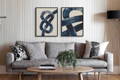
In a living room or dining area, warm and vibrant colours like reds, oranges, and yellows can create a welcoming and stimulating environment. Red is sometimes a difficult colour, but we love using it in the living area. Red can stimulate conversation and a vibrant atmosphere. Check out our shop-by-kitchen art page here.
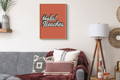
Our colourful typography prints are perfect for your living room.
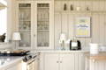
In a kitchen, cool colours like greens, blues, and purples can create a calming and fresh atmosphere, while warm colours like yellows and oranges can make the space feel energetic and lively.
For example, a print of a coastal landscape featuring shades of blue and green can add a refreshing touch to the kitchen walls, while a bold yellow print can add a burst of energy and vibrancy.
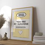
Our best selling – yellow book print is perfect for your kitchen, the combination of a fresh colour and great lyric is perfect for your bustling kitchen.
Our yellow book prints add a soft calm to a kitchen space.
In a hallway, neutral colours like whites, greys, and beiges can create a sense of spaciousness and lightness.
You can add bold prints and artwork that draw the eye and create interest. For example, a black and white beach photograph can create a minimalist yet striking statement, while a bright abstract print adds playfulness and creativity.

A black and white palm print in a hallway.
In a bathroom, we like to create a clean and serene atmosphere.
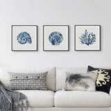
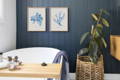
Soft blues and greens are a really popular choice for their calming properties and can be used in various ways, such as through ocean or botanical-themed prints.
For example, our blue seaweed art prints can add a subtle touch of nature and tranquillity to a bathroom space. We love their softness, and the watercolour paint effect suits any bathroom.
Ultimately, the key is to choose colours and prints that make you feel comfortable and at ease in the space.
We also love a good quote print in a bathroom, so check our shop by room page, where we focus specifically on bathroom prints and how to style them.
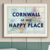
In an entrance or foyer, bold colours and bold typography prints can create a sense of drama and excitement. For example, a map print featuring your favourite travel destinations can set the tone for adventure and exploration and opting for bold typography over the top is a winner.
While a vibrant floral print can create a warm and inviting atmosphere. Using a mix of colours and prints can also create a layered and dynamic look that makes a statement as soon as you walk through the door, so consider a set of flower prints.
Another important factor to consider is the colour scheme of the room. Choosing colours that complement or contrast with the existing colours in the room can help create a cohesive and visually appealing space.

Popular Colour Schemes for Art Prints
When it comes to art print styling, using a popular colour scheme can create a cohesive and visually appealing space. Let's explore some popular colour schemes and how they can work effectively in different rooms.
Monochromatic: This scheme involves using different shades and tints of a single colour to create a harmonious and calming atmosphere. This is a great choice for living rooms, where relaxation and serenity are key. Our indigo knot art prints are popular choices for a bedroom. These prints use different shades of indigo to create a calming and chilled atmosphere.
Analogous: This scheme uses colours adjacent on the colour wheel, such as blue-green and green, to create a sense of unity and flow. This is a great choice for living rooms, where comfort and relaxation are key. Our abstract prints in shades of blue-green and green work well in this scheme and can add a sense of serenity and calmness to the space.

Complementary: On the other hand, a complementary colour scheme, which uses colours opposite each other on the colour wheel, can create a vibrant and energetic atmosphere. For example, a print featuring shades of purple and yellow can add a playful and lively touch to the space. Have a look at the colour wheel below and the following link by Dulux is a great guide on how to use a colour wheel.
Understanding how different colour schemes can create different effects in your home, so it is worth bearing in mind when selecting art prints and styling them in a space. By experimenting with different colour schemes and combinations, you can create a truly unique and impactful look that reflects your personal style and enhances the mood and atmosphere of your space.

Bringing It All Together with Beach House Art
At Beach House Art, we offer a wide range of art prints in various colours and styles to suit different tastes and preferences.
Whether you're looking for coastal art prints in calming blues and greens or bold and vibrant map prints to create a conversation piece, we have something for everyone. With our high-quality prints and personalised book cover posters, you can add a touch of colour and personality to your home decor.
We really hope you have fun and experiment with the colours and prints in your home.